The Mystery Surfer
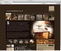
The NSS Mystery Surfer trawls the internet to find the latest website developments by companies in the stone industry. This month he stopped at www.stoneinteriors.co.uk
This month I decided to enter ‘stone interiors’ into the search engines to see who heads the lists. In Yahoo and Bing, the first and third results that had not been paid for were from Greenwich company Stone Interiors. In Google, the company took the first and second spots.
Admittedly, ‘stone interiors’ is not a term widely used by people looking for stone nor as a keyword by websites, so competition for the top spot is limited. According to Google, the number of monthly searches globally using the phrase is about 5,500 and only about 1,000 of those are from the UK.
People in the UK are much more likely to be more specific, using terms such as ‘stone floors’ (40,500 uses a month, just about all of them from the UK) or ‘granite worktops’ (60,500 searches a month, around 50,000 of them from the UK). On the other hand, far more sites use these terms as keywords, so competition for listings positions is greater. Neither term brought up Stone Interiors on the first page of Google.
You have to use search engine analysis figures with some degree of interpretation, but for the purposes of this level of investigation it is reasonably safe to accept them at face value.
Most stone companies would be inundated if they received 1,000 enquiries a month – and no doubt Stone Interiors would be as well. Even if everyone who entered ‘stone interiors’ as a search term visited this particular company’s website it would be extraordinary if they all made contact – not because the website gives them any reason not to but just because not everyone does.
The site itself has a clean, uncluttered design. It is commendably simple to understand how everything will work and what it is going to show you. And what it does show you is a lot of good quality, inspirational photographs that are going to have the mouths of anyone looking for bathrooms or kitchens watering.
A big problem for me was that there was no additional information about the pictures. You do not need chapter and verse, but some detail would be helpful so that visitors can at least say they want this or that stone seen in the pictures. Click on a panel labelled ‘view materials’ and you always get the same five unidentified pictures, regardless of what you were looking at previously.
Terms such as ‘marble’, ‘granite’ and ‘stone slab’ in the text are highlighted, which you think might take you to some additional information if you click on it. But it doesn’t. It just brings up the same five pictures.
As I have said before, it is worth adhering to that old acronym KISS (keep it simple, stupid) on websites as much as any other marketing tool. But if the message is not being conveyed, you have not kept it simple, and the would-be customer will have to find out the details he or she needs in some other way.
If a customer likes the stone in one of the pictures on the Stone Interiors website, they cannot simply pick up the phone or send an email and talk about it. They would have to try to explain it and at that point communication is already breaking down. Frustrate people’s expectations with your website and you might lose them for ever.
A great comfort factor from Stone Interiors is an address, telephone number and email address that stays with you whatever page you visit. And if you click the contacts button you get the names and contact details of all the main personnel, which is refreshing.
We all know why the directors of some firms make it as hard as possible to trace them and their business, so it is confidence boosting to discover the managing director’s name, direct telephone number and email address on the website.
This website would leave me feeling particularly comfortable about dealing with this company but not much wiser about what stone I could have in my kitchen or bathroom and completely uninformed about how much it would cost.

