The Mystery Surfer : A breath of fresh air
The stone industry really seems to be getting a handle on this website malarkey. A lot of the companies in the industry have relaunched their websites lately and in most cases it is a great improvement.
Most of us probably put up a website originally without really knowing what we were trying to achieve. As time has gone on the vision has cleared somewhat and the enquiries we get via the websites now have probably helped us all to understand what a website is going to achieve and what it isn’t as a sales and marketing tool. Second, third, fourth, fifth generation websites just keep getting better… generally.
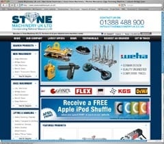
I have spent some enjoyable hours this month looking at the new website of Stone Machinery UK Ltd (Incorporating National Masonry Ltd), as they now style themselves.
I have been enjoying myself because the website is a breath of fresh air.
It is easy to look at and easy to use. It contains information – and levels of information so if you want more you can usually find more, including some videos of the machinery in some cases and, in most cases, specifications regarding size and capabilities.
Not all the information you might like is available in every case and sometimes the information supplied by the manufacturer has not been compatible with the website design program when it has been pasted in and has resulted in nonsense. For example, details of the Marmo Meccanica HTO-GARBI+ include the information “in addition to the fixed positions 0Ã?â?‰Ã‚°, 45Ã?â?‰Ã‚°, 90Ã?â?‰Ã‚° etc…” But there are a lot of entries and I’m sure as the site develops these peculiarities that computers like to throw up will be rectified as someone works their way through the text entered.
The framework of the site is well established. It is clean, uncluttered, well-presented, and straightforward. It has an excellent clarity of vision about what it wants to achieve, which is clearly to present and sell all the machinery, tools, consumables and handling equipment you might need in a masonry workshop.
There’s enough animation from scrolling banners to keep the site interesting, but not so much that it just becomes a confusion of images.
There is a special offer of iPod shuffles if you spend more than £500 to add a bit of interaction and interest for customers and there is contact information on every page, so if you don’t want to buy on-line but prefer to contact Stone Machinery, or want to check anything before you buy, you can do so without having to search around for how to do it.
Search engine optimisation is good. When I Googled ‘stone machines’ up came stonemachineryuk.co.uk on the top of the first page. Entering ‘stone processing machinery’ was not quite as good, but nationalmasonry.co.uk, which seems to be the same site, was on the second page. Entering ‘stone handling’ – and Stone Machinery UK have a lot of handling equipment now they represent Weha – and they were on the second page of Google.
It is always a pleasure to visit a website that is both showing more information than it is trying to hide and making it easy to find and view that information. My rating for this site is 89%.

