The Mystery Surfer : Visits the new website of St Astier
The NSS Mystery Surfer trawls the internet to find the latest website developments by companies involved in the stone industry. This month he visited the new website of consulting contractors St Astier at www.st-astier.co.uk
Websites are getting better. Mostly, the latest generation of websites work as they are supposed to and generally they have what they say they have on every page.
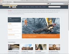
One of the newly launched, next generation websites I visited this month is that of St Astier, the consulting contractor.
It has a blog, with the latest entry from 25 July when I visited it at the beginning of August, which isn’t bad. Blogs can be the modern equivalent of ‘news’ pages. Maybe the word ‘blog’ is more attractive to some readers than the word ‘news’ and it possibly opens opportunities for more comment than might be desirable in a press release. Alan Gayle has some useful advice on social media in his column on page 10 that is worth noting.
Minor irritations: The St Astier’s designer has chosen spots for a background which had the effect of making the site look pixilated to me.
On the left of the home page are boxes showing the various disciplines that St Astier works in – ‘heritage’, ‘housing’, ‘structural’, ‘industrial’ and ‘civil engineering’. They turn orange when you put your cursor on them and black with white text when you click them. But at first nothing else happens. The scrolling pictures they point to on the right continued scrolling.
Eventually the scrolling slowed and then stopped on the picture that was relevant to the subject with the word and arrows indicating more information on the subject which did, indeed, take you through to a level two page on the subject. But it is all a bit ponderous, which is not generally a good idea on websites. If it is intentional to keep visitors on the site longer it could backfire.
If you don’t like it (or if you do) you are encouraged to tell St Astier because after a while a pop-up interrupts your browsing asking for your comments. I often wonder how many people bother filling in such surveys. Most people I know just get annoyed by the interruption.
Improvements: The company’s ‘Services’ are now included in the primary navigation at the top of each page alongside a new ‘Expertise’ section with case studies that can be downloaded.
The ‘Projects’ section is easy to navigate with plenty of space allocated to site photography on individual schemes, so the work speaks for itself. St Astier promises new projects will be added each month.
There is a smattering of social media and St Astier say they are relaunching the email newsletter, which you can sign up to on the website.
The site has been built using the latest HTML5 and CSS3 web technology, which is good for videos. There aren’t any at the moment but St Astier promise they are on the way.
With the proliferation of smart phones and tablets now, a responsive design has been used to create a flexible layout that changes the presentation of information depending on the user’s screen size. It is something that ought to be considered for all website updates these days.
The result from St Astier is content that’s easy to link to and use whether on an iPad, iPhone, laptop or desktop computer, with the layout changing to suit the device you are using… Well, as long as you are not using Microsoft’s Internet Explorer 6, which is now 12 years old and is not usually supported by new websites any more. You will be fine with IE7 onwards.
Apart from my minor quibbles, it is a good site developed with the way the internet is used these days very much in mind.
- Following my mention of premium rate telephone numbers in the June issue, I have been asked to point out that not all 0845 telephone numbers carry a premium rate charge. Some companies use them so that callers only have to pay local rates, wherever they call from. The trouble is, you do not know what rate you will be charged before you dial the number.

