Colour confidential
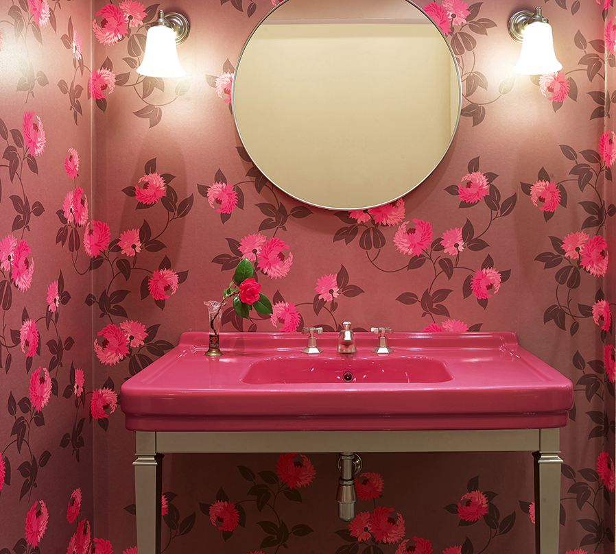
Back in 2003 I remember asking Leatrice Eiseman, Executive Director of the Pantone Color Institute (it’s American), why she had selected a particular shade of green as the influential colour in the year ahead. At the time, her succinct answer rather rocked me back on my heels. “Shrek 2.”
My immediate reaction was that her reply was a bit glib and rather left field. But the more I thought about it – both on the day and subsequently – the more the answer from Lee (as she is known in her professional circle) made sense. After all, she’s not renowned as the world’s foremost colour authority for nothing!
Imagine you are Dulux and you want to introduce a new rich deep green paint to the market. Imagine you could get this colour on TV screens across the world several times a day, as well as on giant promotional posters, toys, books, fast food packaging and, of course, in every scene in the year’s most popular film.
What’s more, imagine your new colour being associated with joy, laughter, family bonding, happy endings and all the good vibes of Shrek. Put it together and you’ve got a marketer’s dream.
No wonder, then, that back in 2004 so many of us started to paint our bathrooms, kitchens, front doors, and living rooms Shrek green. The power of the subconscious should not be underestimated.
Our exchange was in the early days of Pantone Colour of the Year, the announcement of which is now a key diary date for product and interior designers across the globe.
As Lee explains: “In 1999 when we launched the initiative we were all worried about Y2K and whether our computers would crash. We chose a colour for 2000 that would personify the future (Cerulean Blue) because it was inviting, hopeful, clean, and enduring. We wanted to embrace the idea of the steadfast, constant sky.”
But Lee doesn’t think there are fixed rules of colour use that have to be followed.
“Keep an open mind,” she says. “There are so many urban legends that fly around the internet that I try to dispel – like the old rules about what-goes-with-what. If you have a favourite colour, you can find a way to make it work.”
However, she is clear about the depth of knowledge, care, and thought that goes into the Pantone Color Institute’s colour selections.
Lee says: “Colour is not just ‘let’s throw darts at the Pantone charts and see where it lands’, it requires meticulous research and is based on a lot of criteria, not the least of which is knowing about your target audience and their lifestyle.”
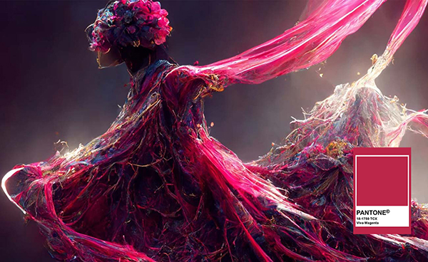
So what hue or tone has Lee and her team selected for the coming year? The answer, billed as an unconventional shade for an unconventional time, is Viva Magenta 18-1750.
It is a strong, bright, pinky-red tone full of life; powerful; stimulating. It celebrates life, with connotations of audacity and rebellion. Dynamic and inclusive, it encourages experimentation and daring.
Viva Magenta promises to bring exuberance, vivacity, and a positive spirit into our homes.
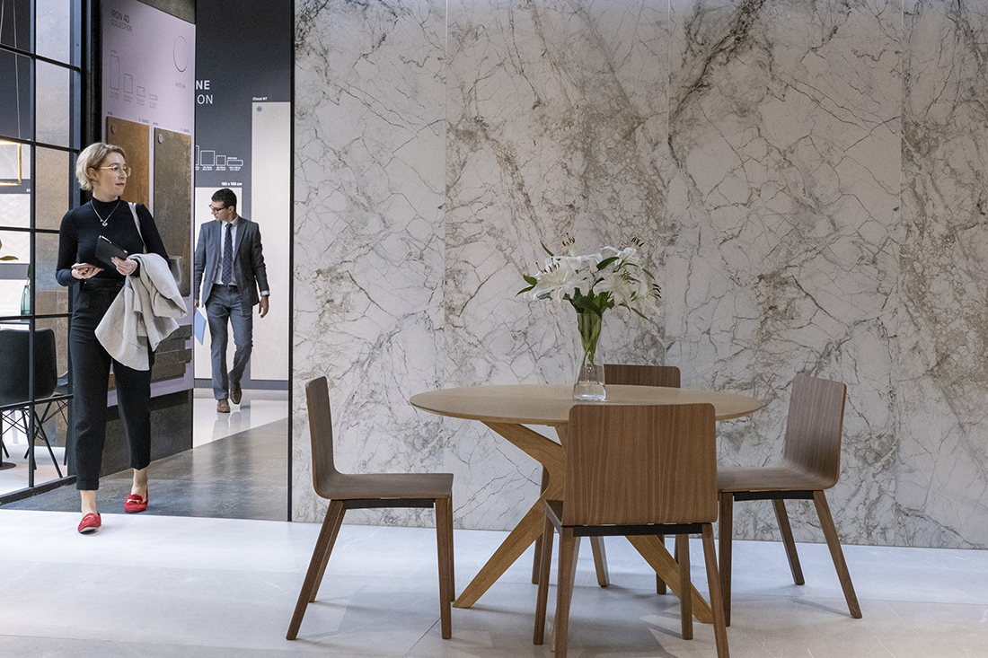
Given these turbulent times, it is great to find a positive note for 2013 and it will be interesting to see how the worktops and tiles that will be seen at the Hard Surfaces exhibition co-locating with the Natural Stone Show at ExCeL in London on 6-8 June this year, respond to the Viva Magenta inspiration.
